30+
Countries
20+
Products
1,000's
of Retailers
5+
Patents & Trademarks


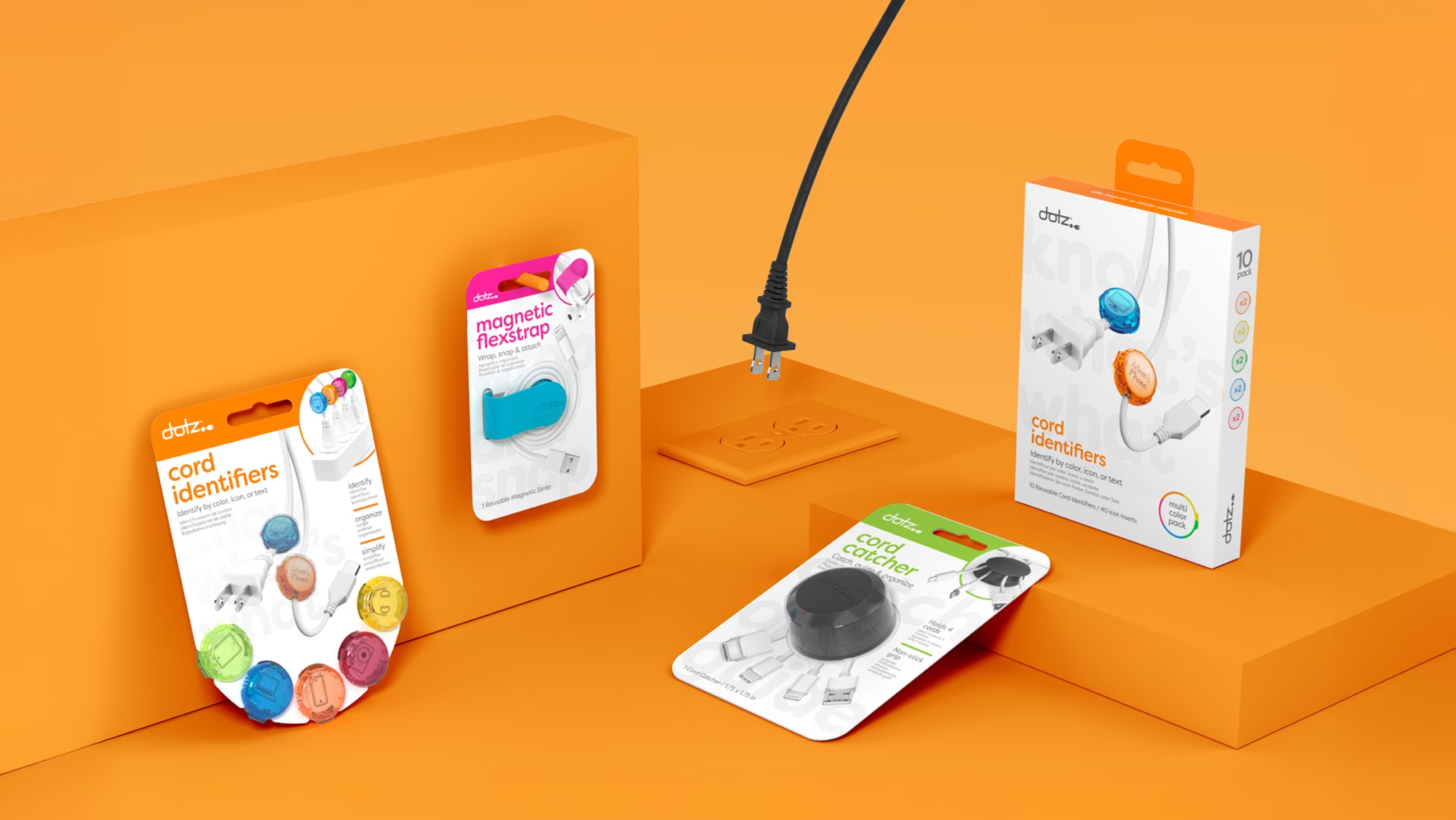
Fun but Effective Visualization
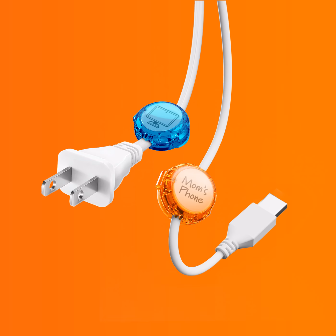
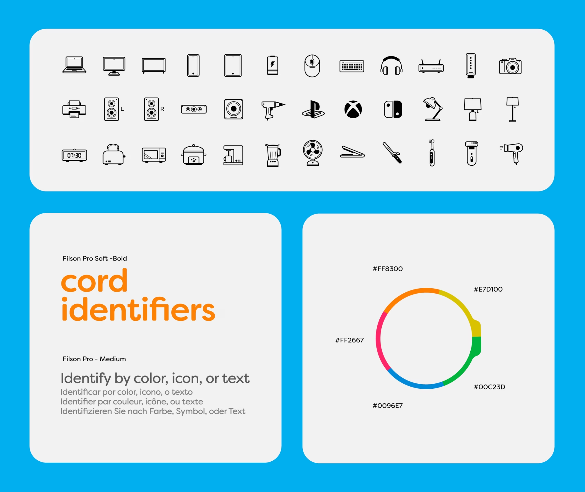
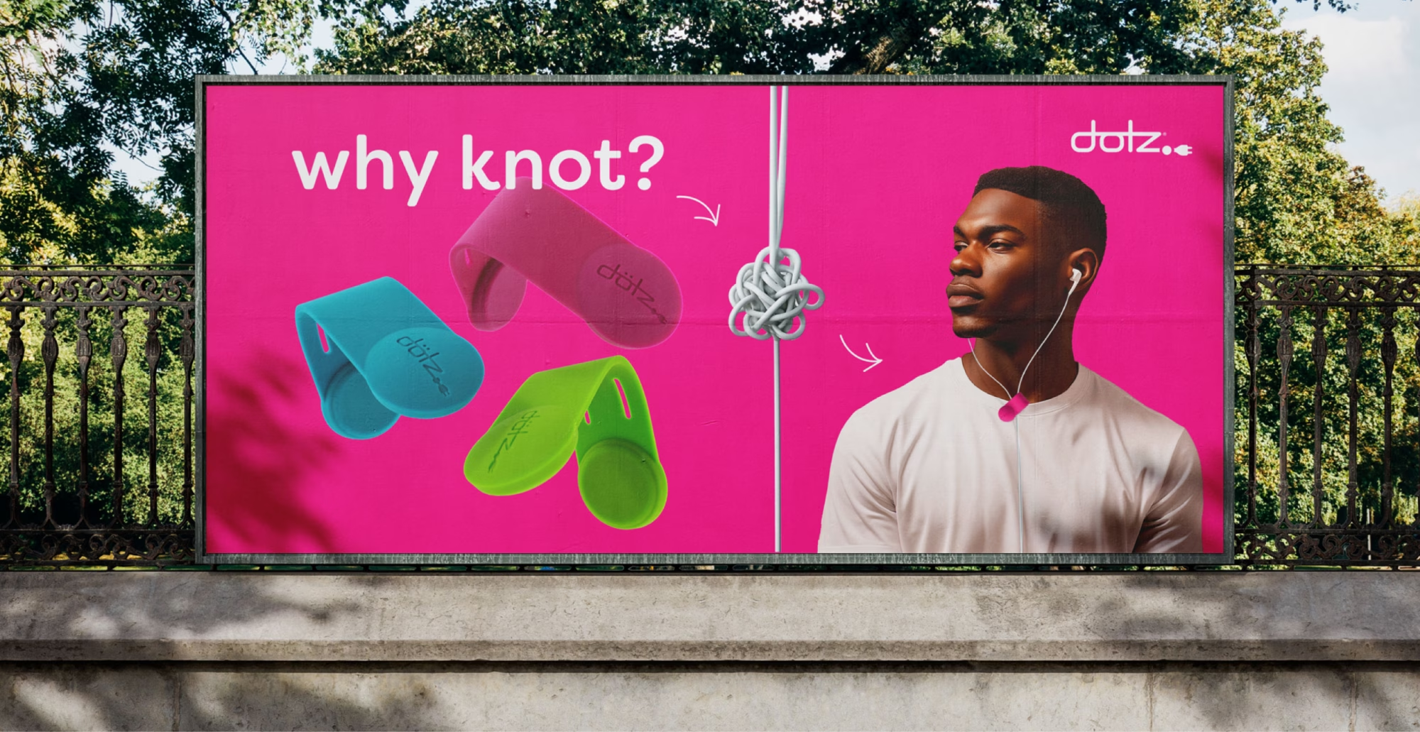
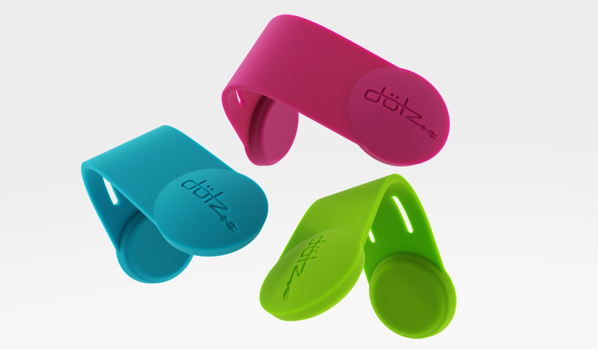
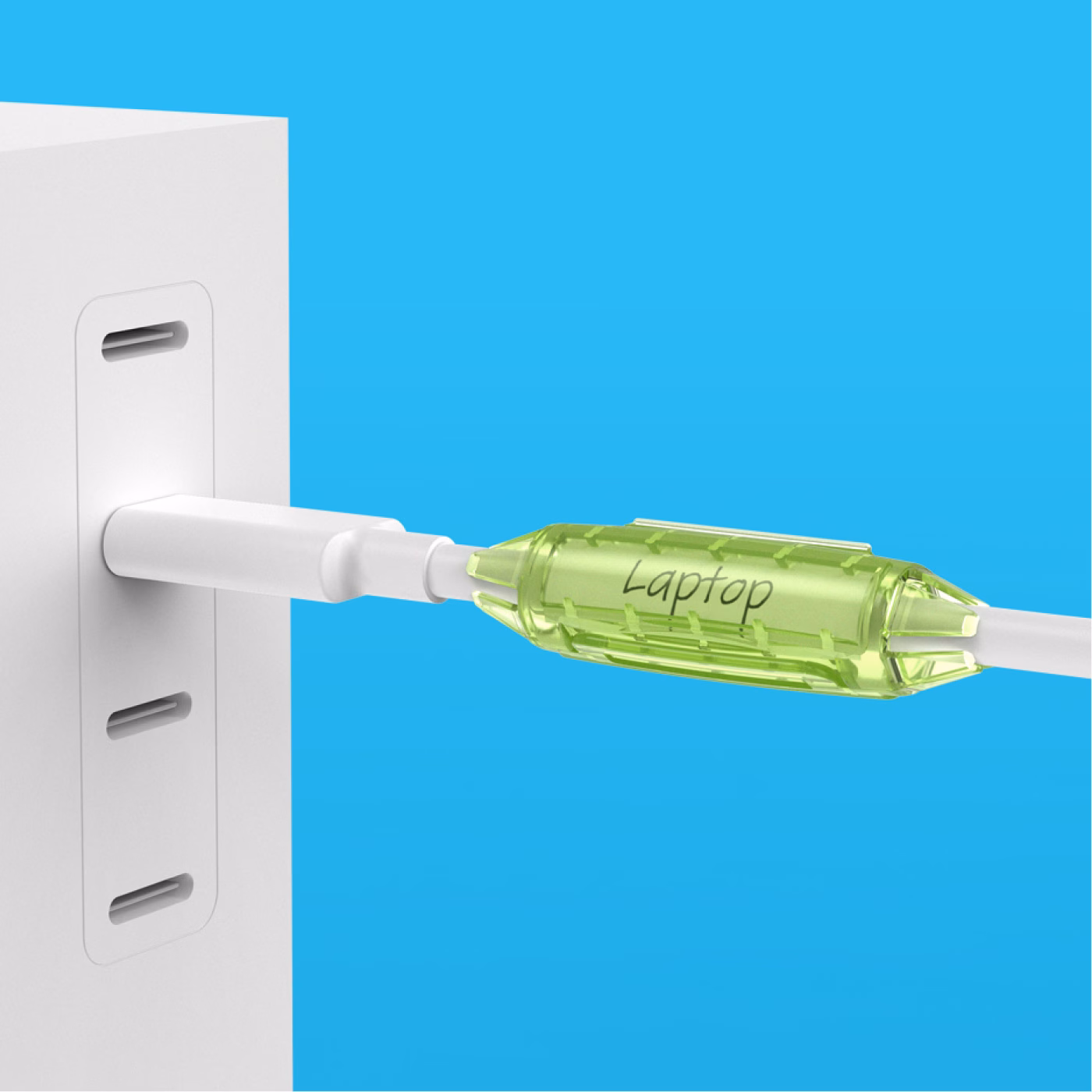
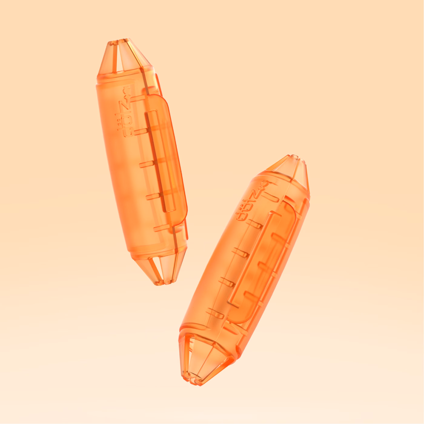
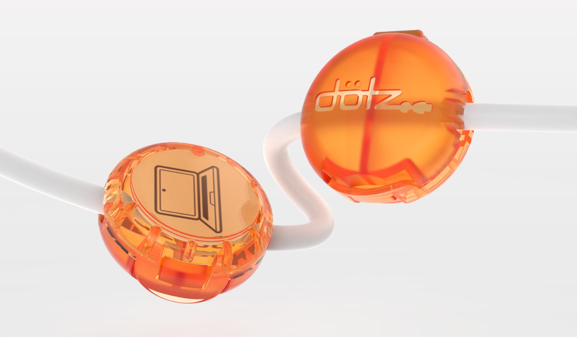
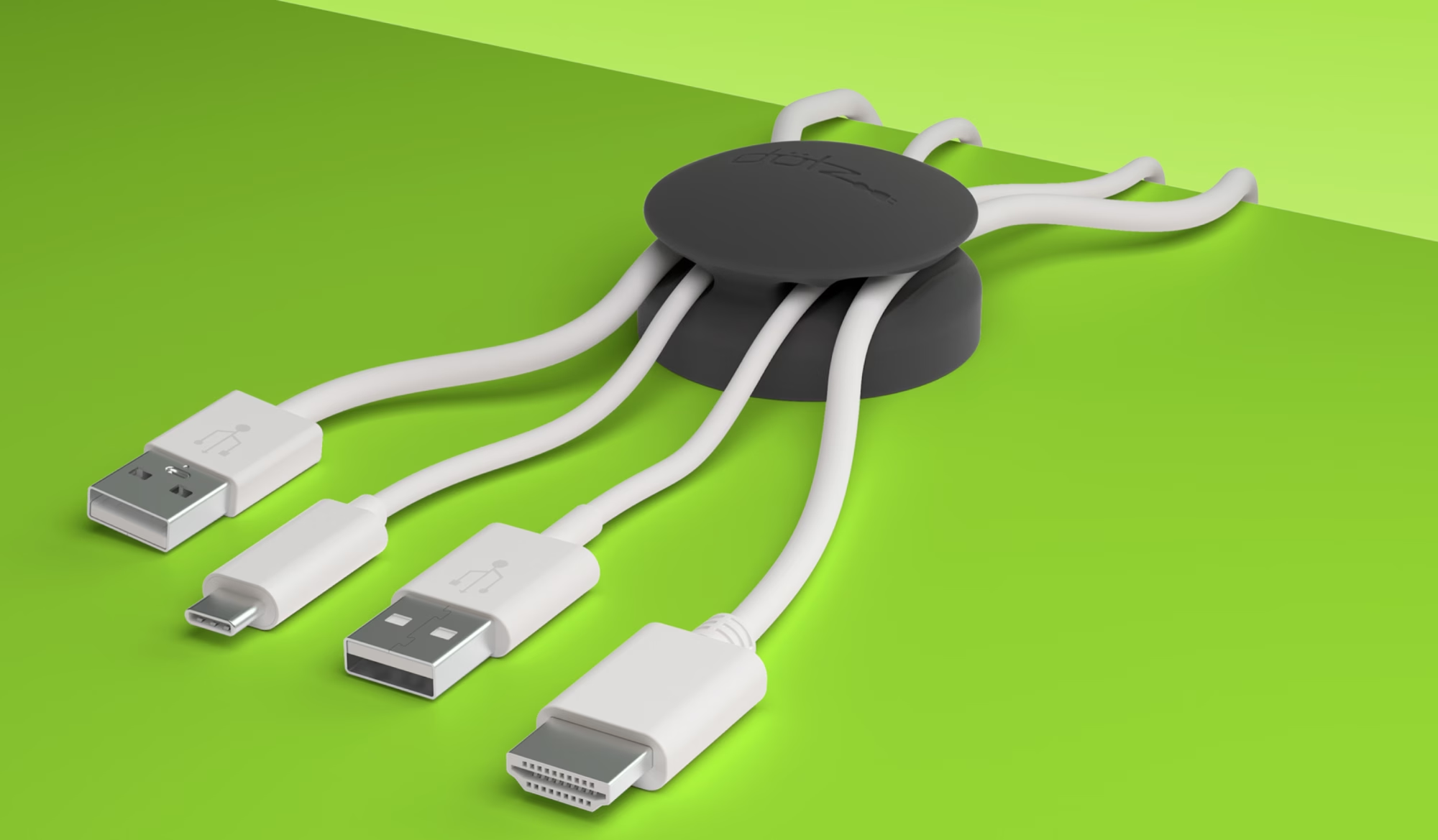
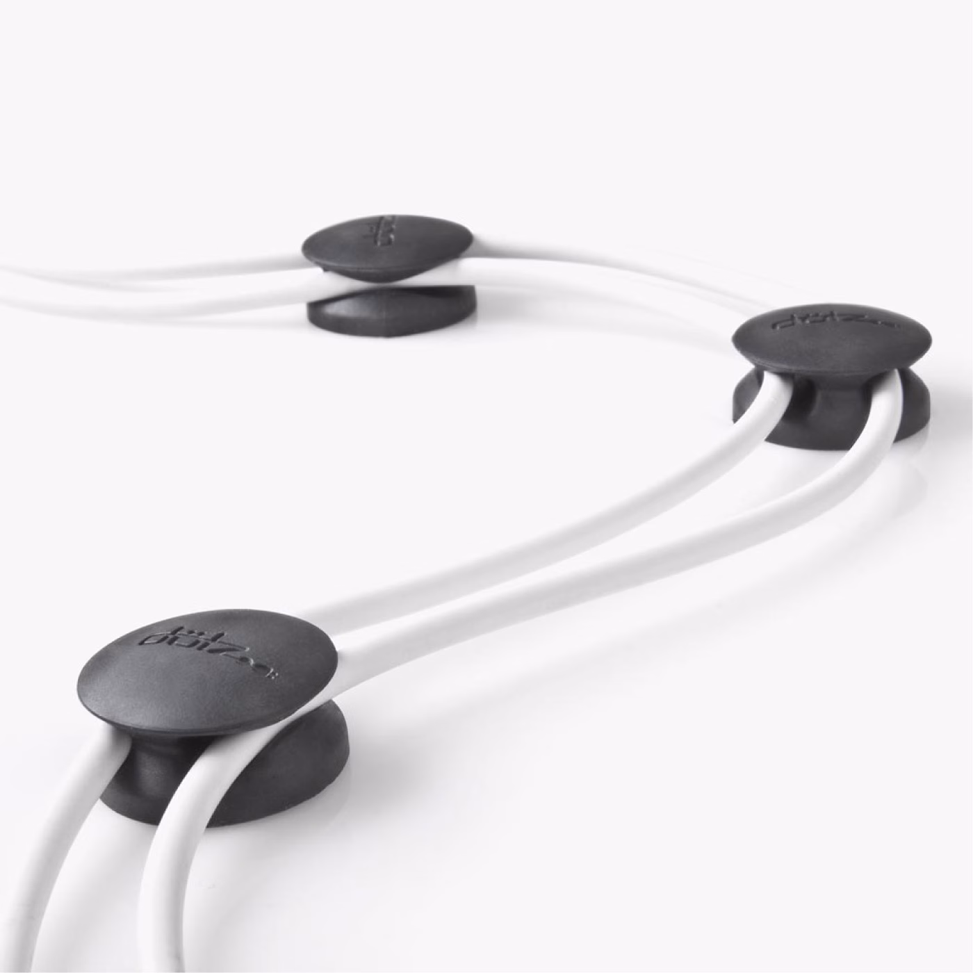
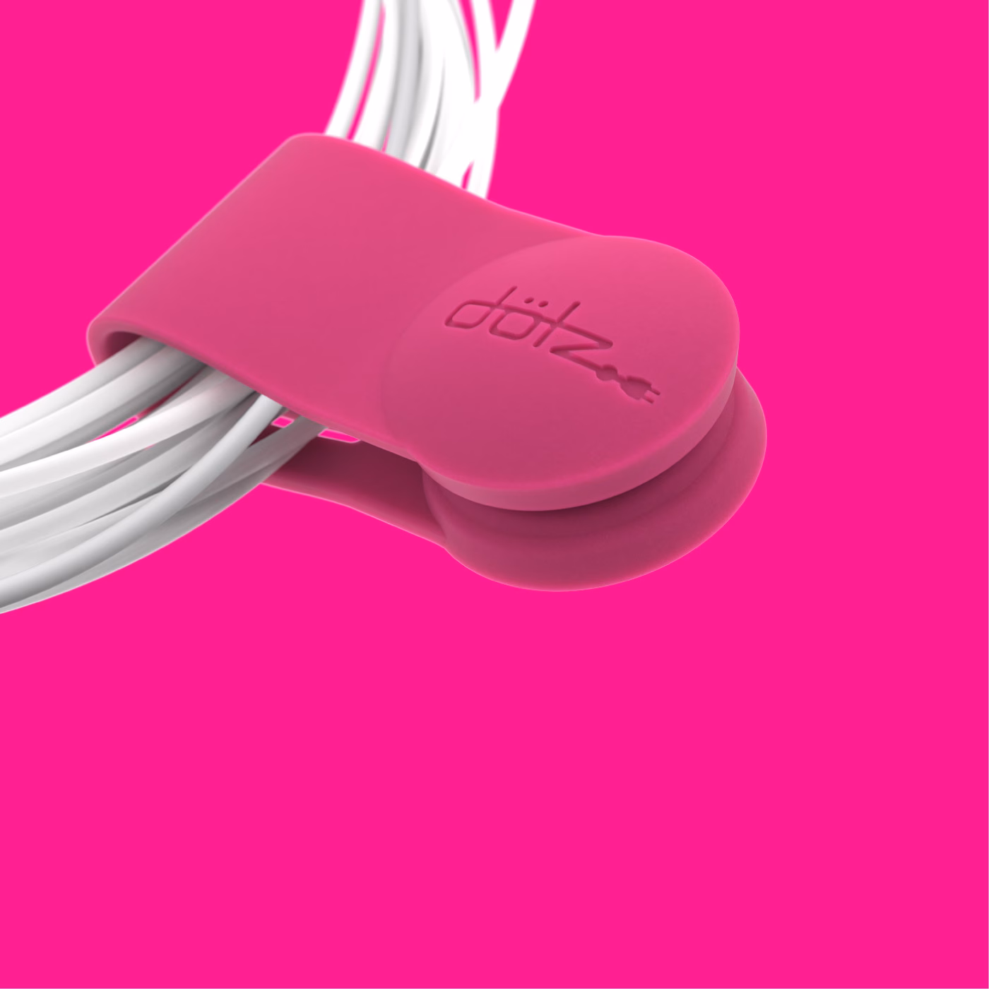
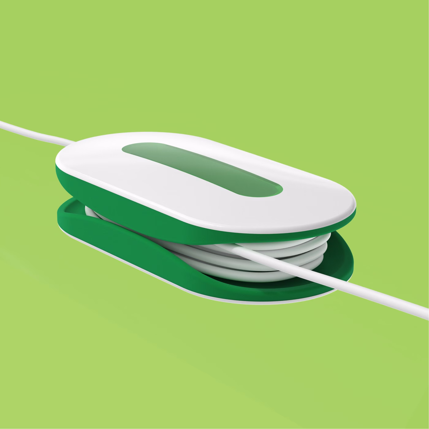
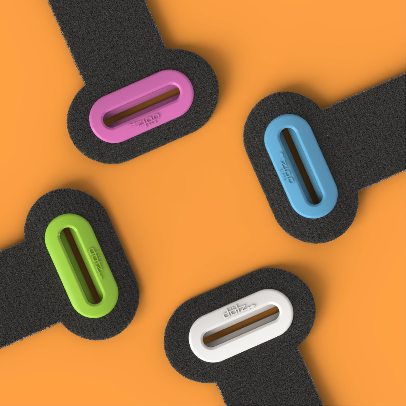
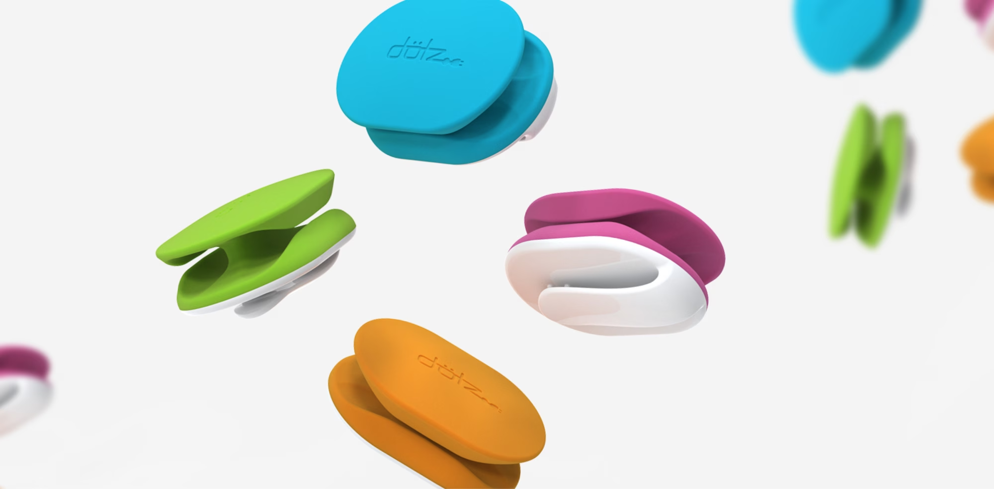
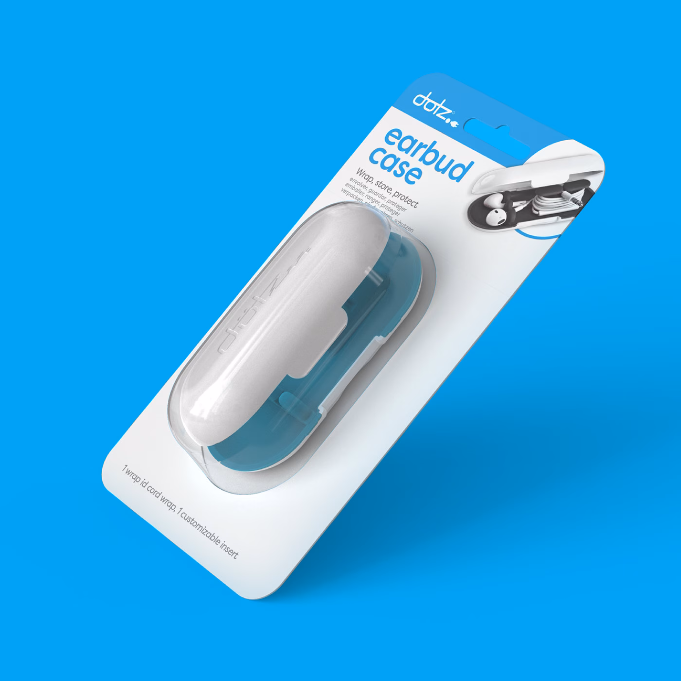
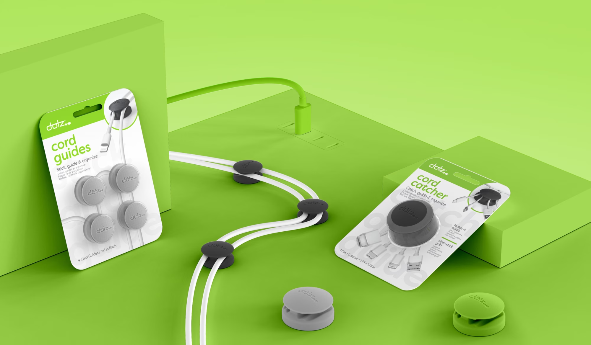
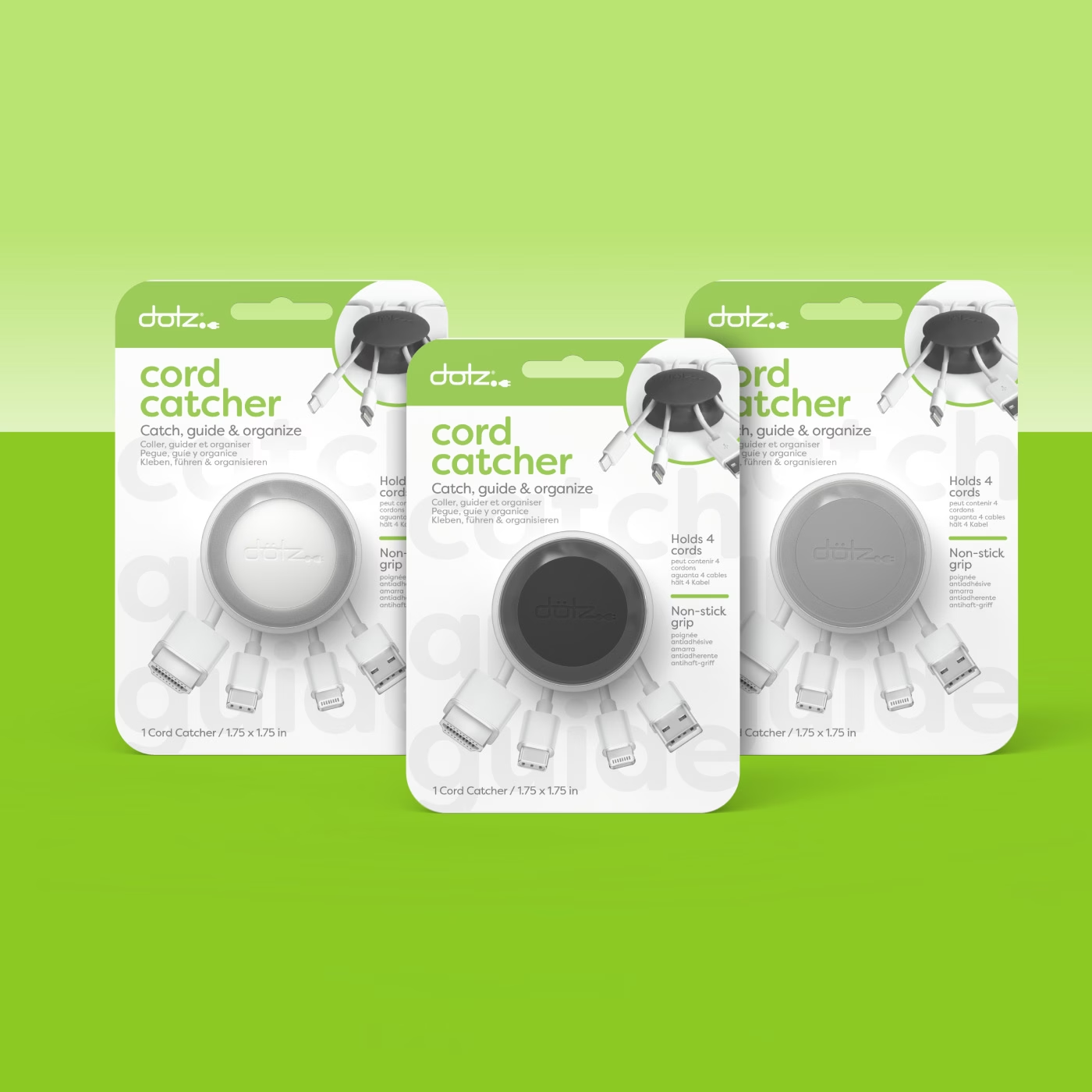
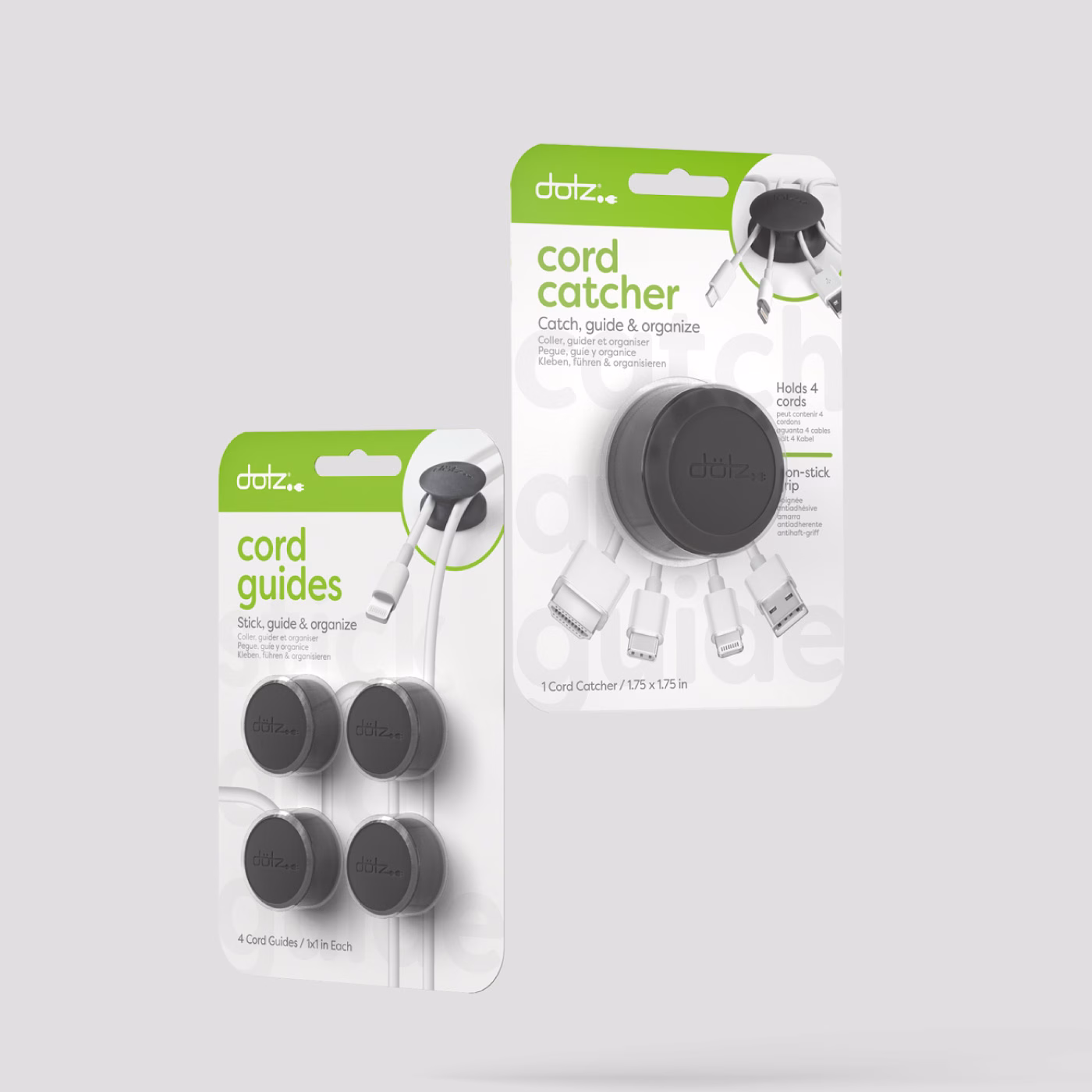
As part of the rebrand, we elevated the visual language to better reflect what has always defined Dotz: quality, intuitive design, and products that solve real problems while still feeling elevated. The new imagery communicates relevance through form, function, and everyday use, highlighting how each product is engineered with simplicity in mind and built around the natural properties of its materials. Dotz has always believed in innovation through simplicity, clean forms, smart details, and solutions that feel effortless.
The brand originated from a desire to create a high-end perception without pretentiousness, using color not only for identification and universal usability but also to inject a sense of play into a category that is anything but exciting. After all, no one hears “cable management” and thinks fun, Dotz set out to change that.

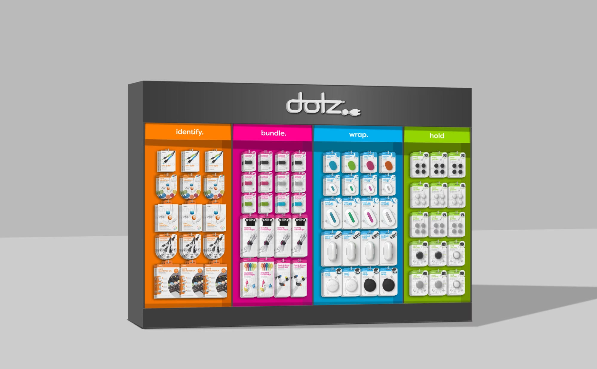
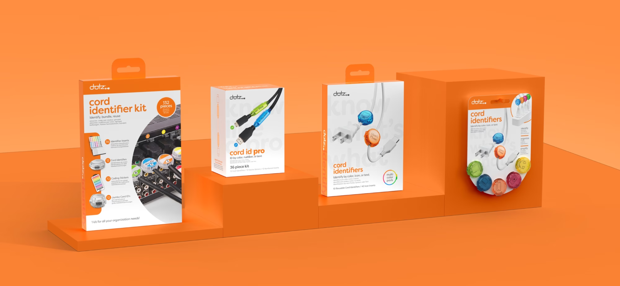
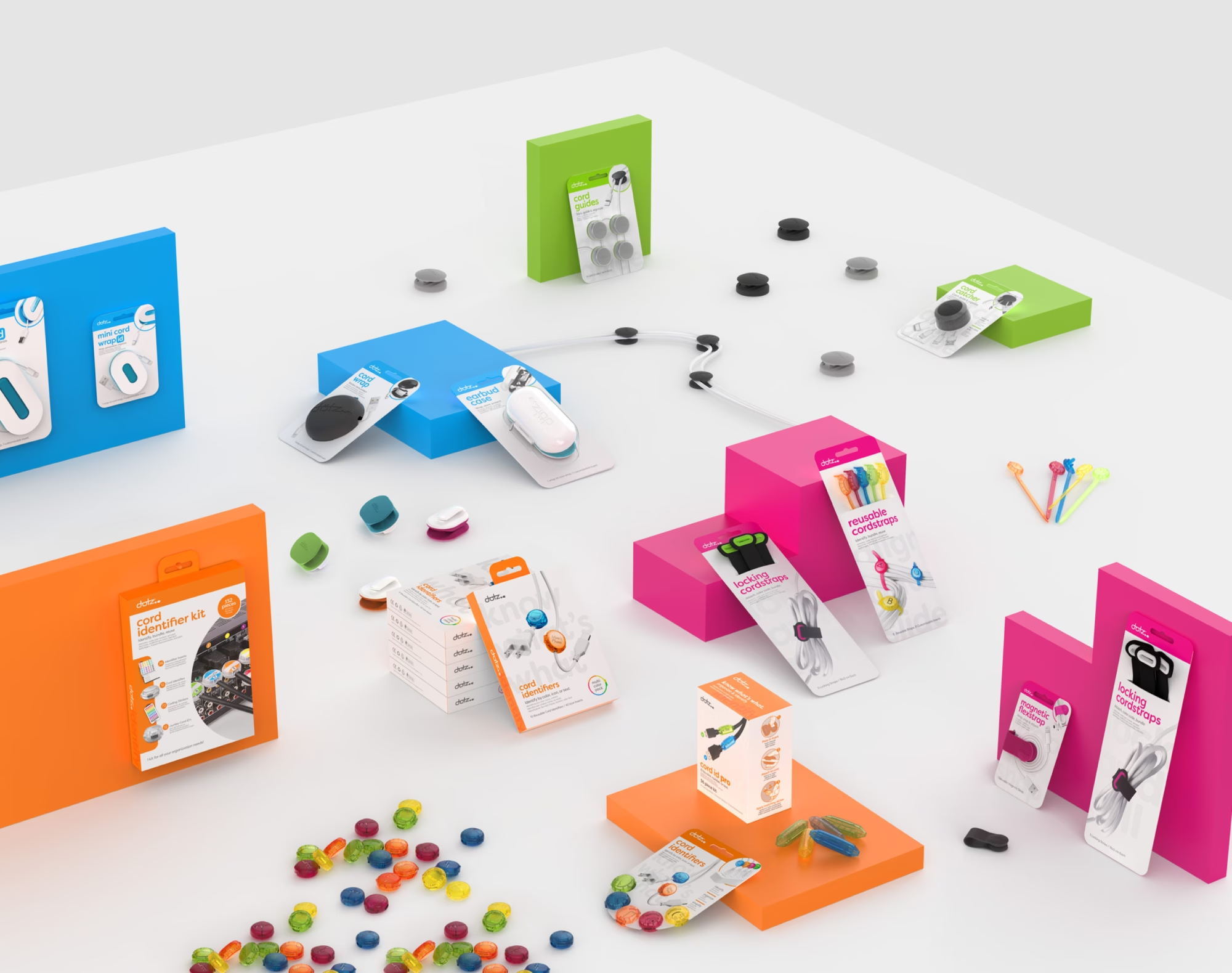
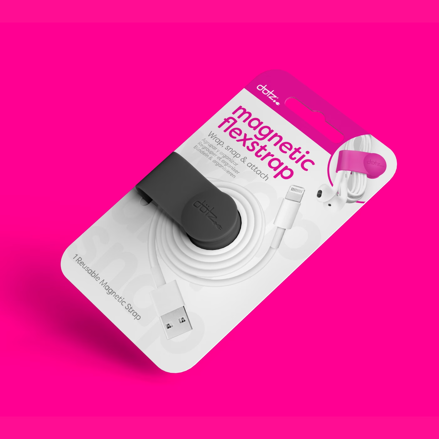
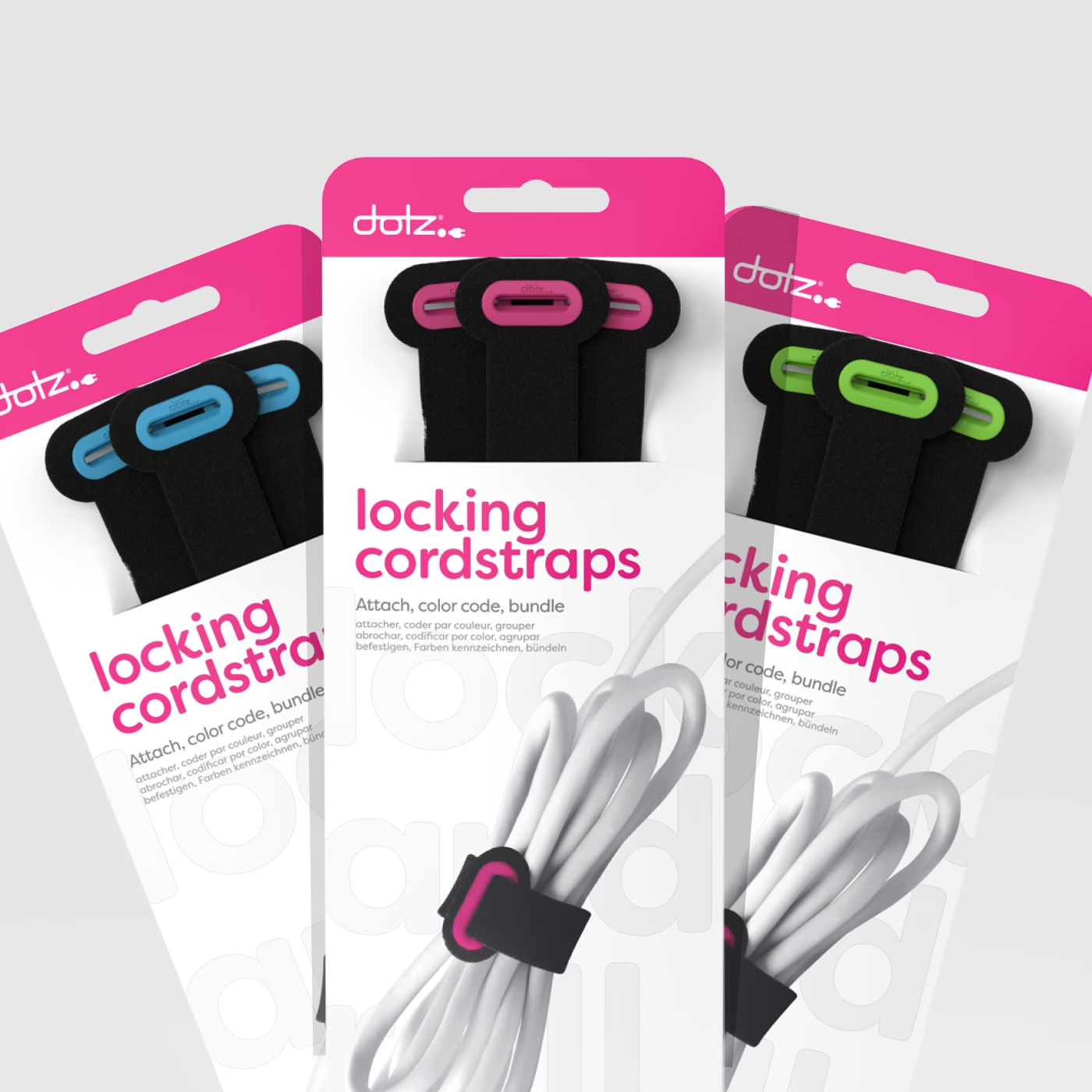
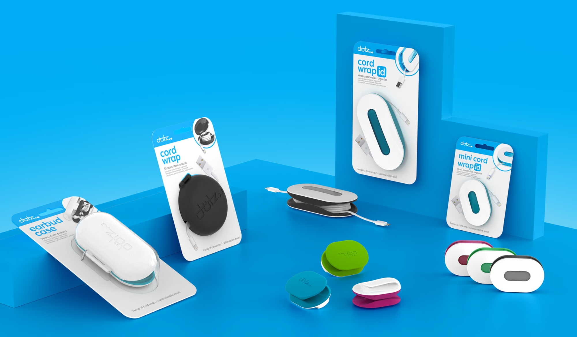
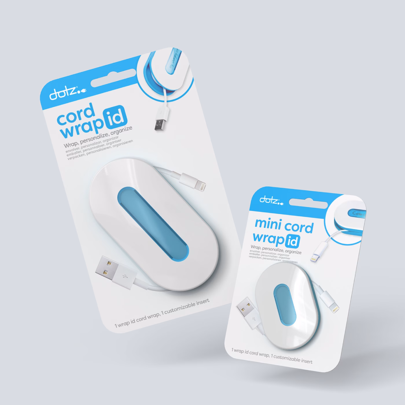
A Flexible Packaging System
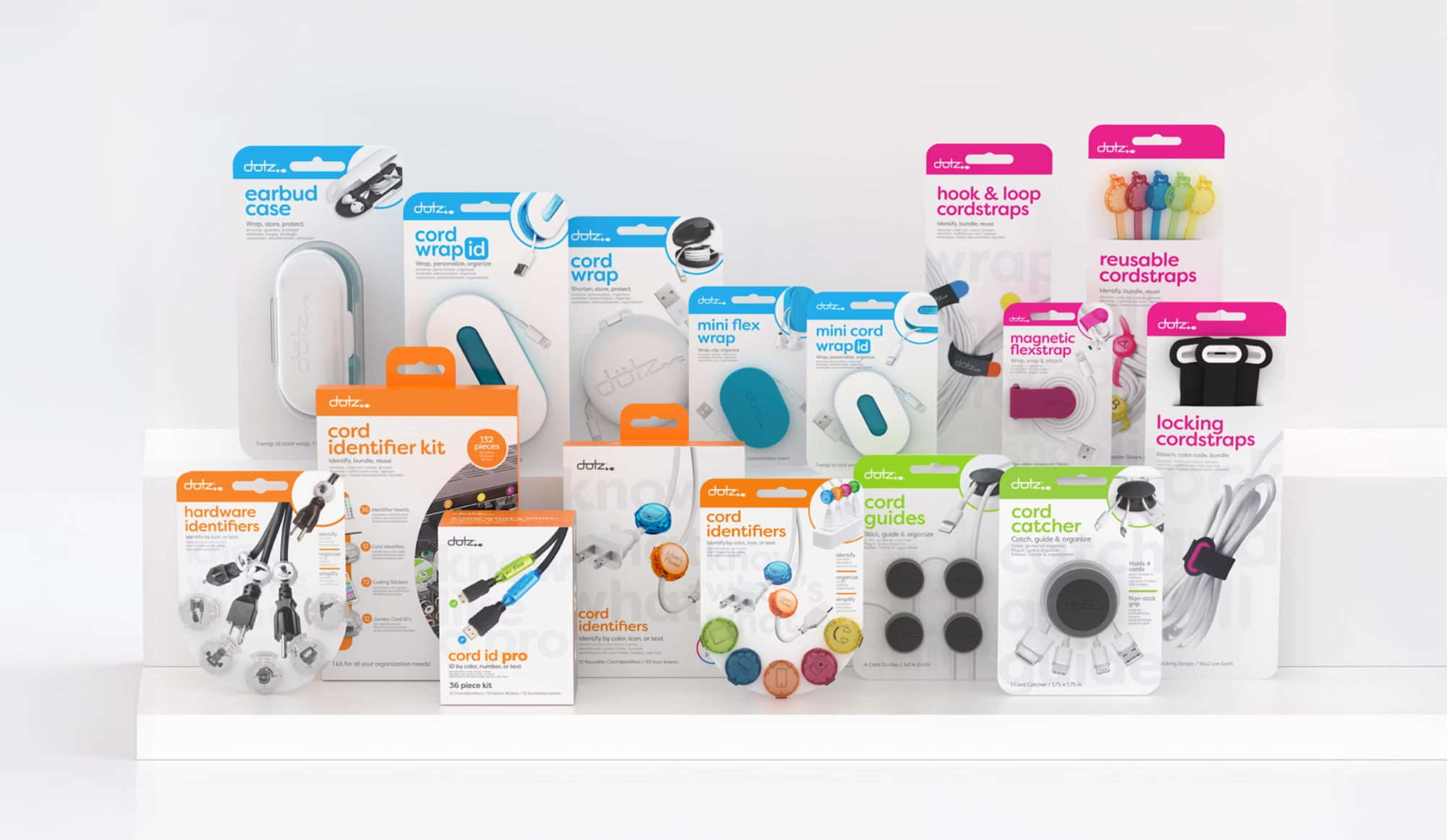
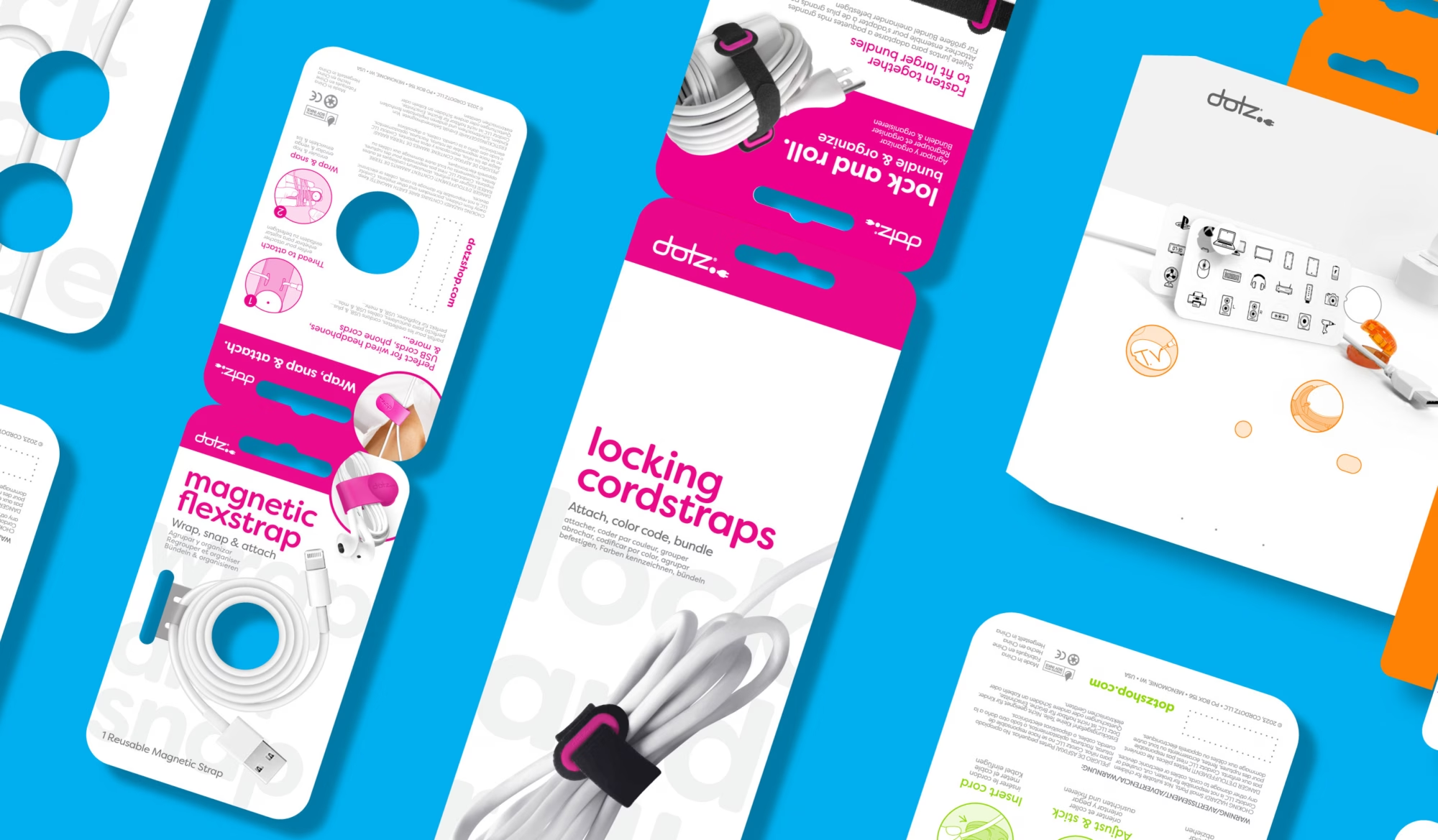
With the rebrand, we also refreshed the Dotz packaging system. The goal was to simplify communication, modernize what already worked, and preserve the categorical color structure that originally defined the brand. When Dotz first launched, cable management had no true home in retail, making placement difficult. The products could sit in almost any department, electronics, organization, hardware, impulse, or seasonal.
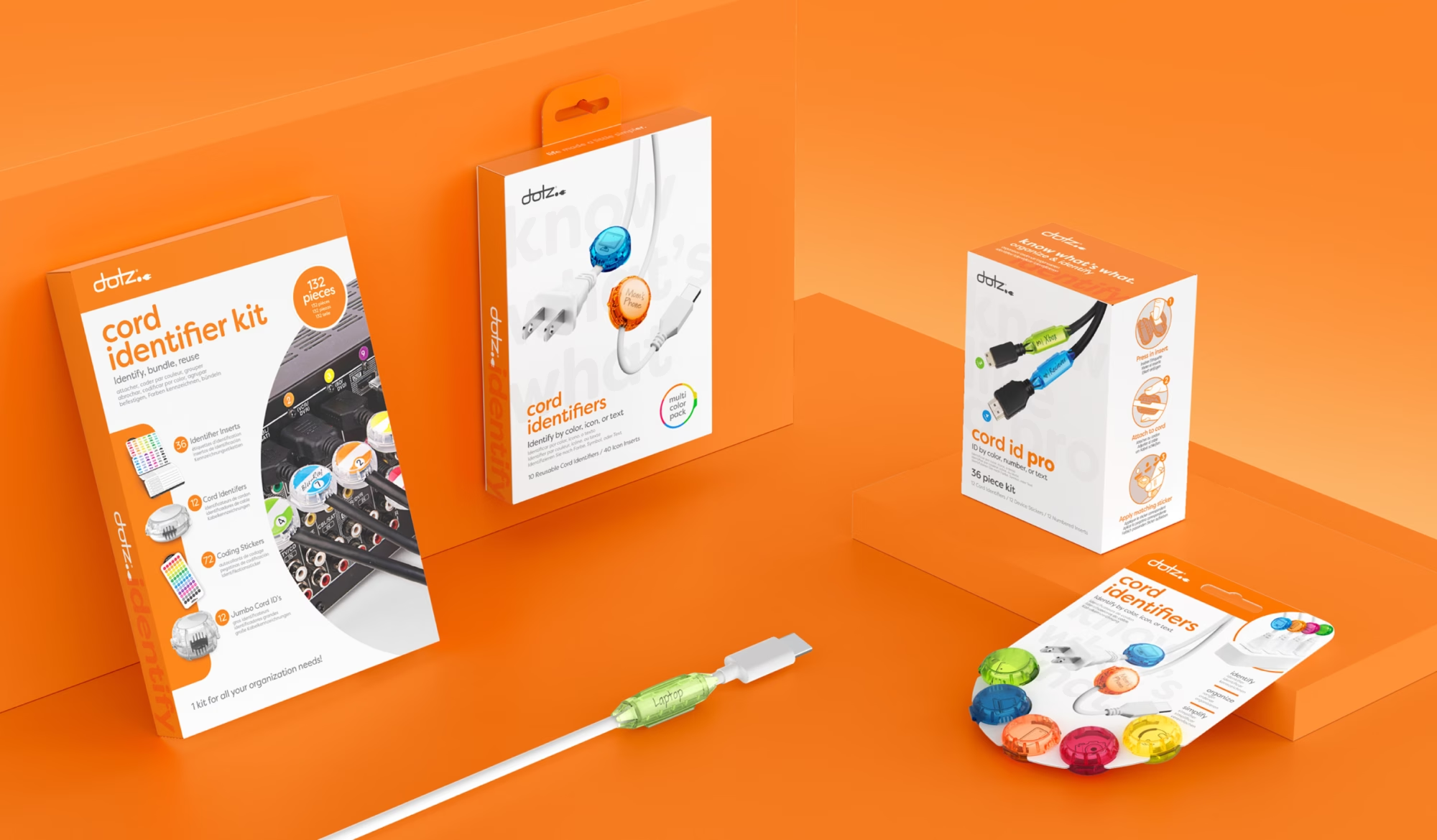
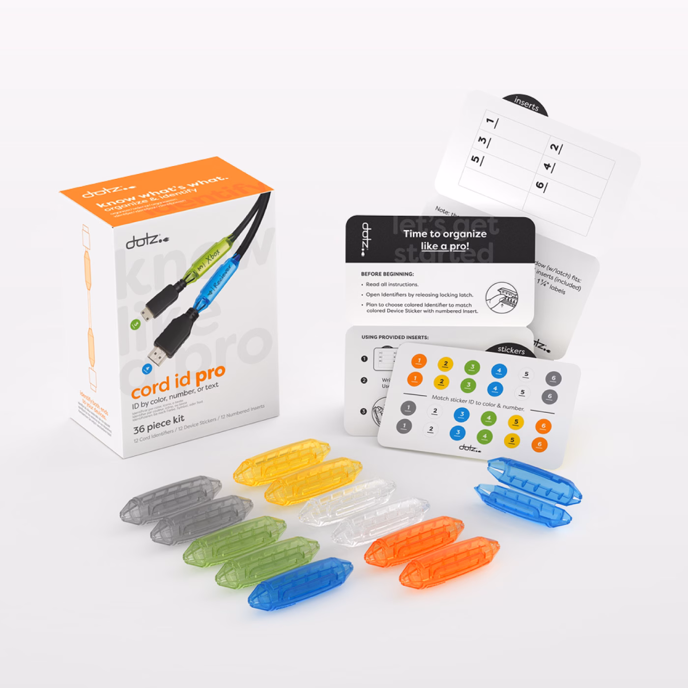
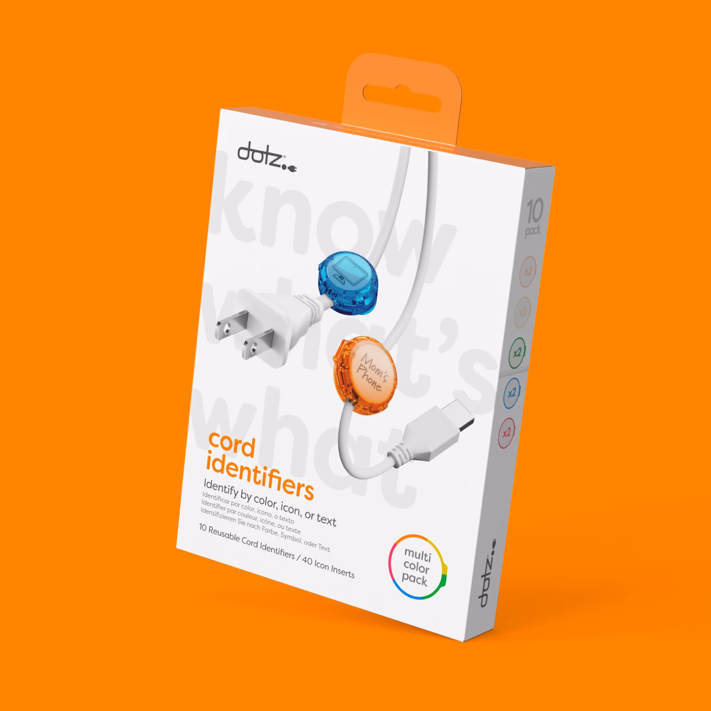
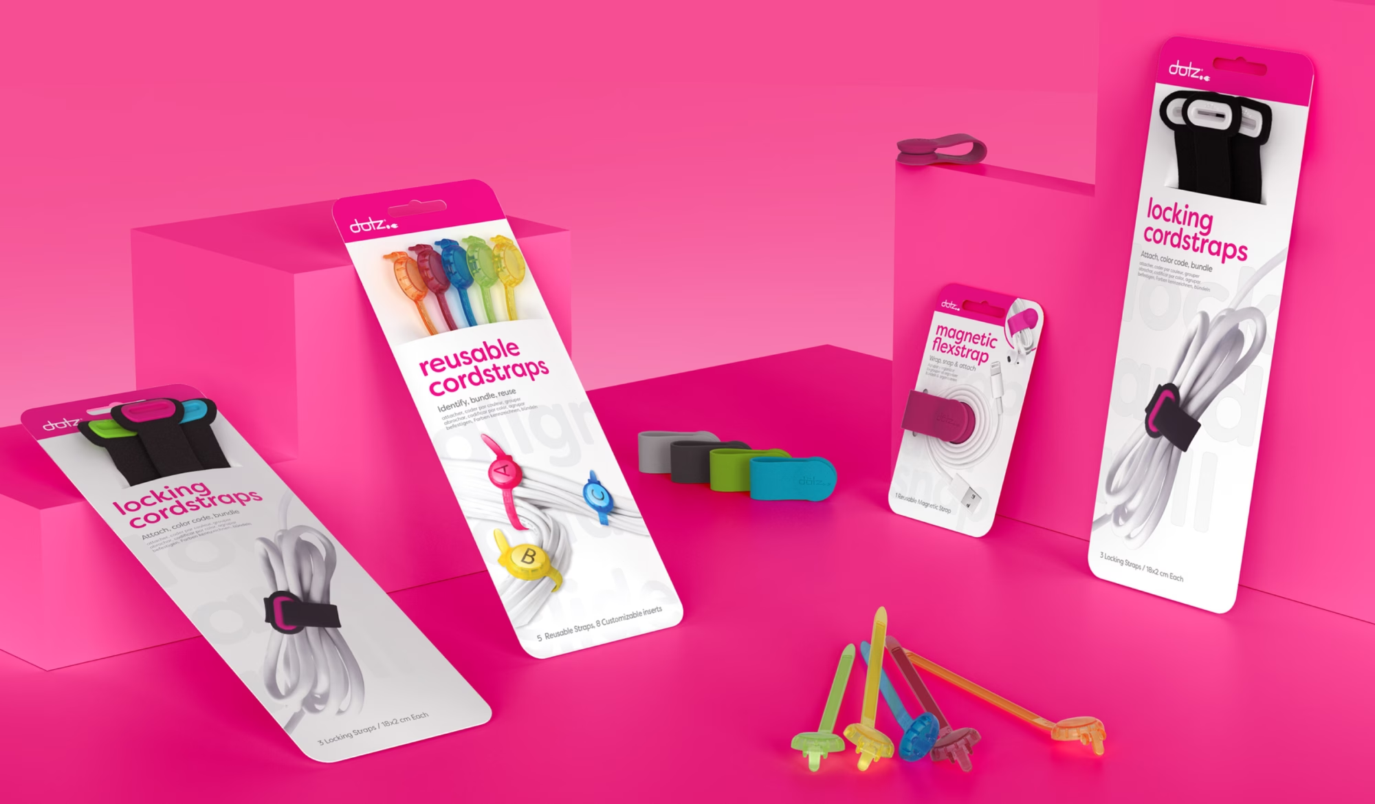
To solve this challenge for retailers, the Dotz team developed a clear, color-coded categorization system based on product function. The line was organized into four simple groups: Identify, Bundle, Wrap, and Hold. This structure made it easy for retailers to visualize how the products fit into their stores and gave consumers an immediate way to understand which item solved the specific problem they were facing.
We also streamlined the packaging itself to minimize material use and ensure it performed effectively in a wide range of retail environments.


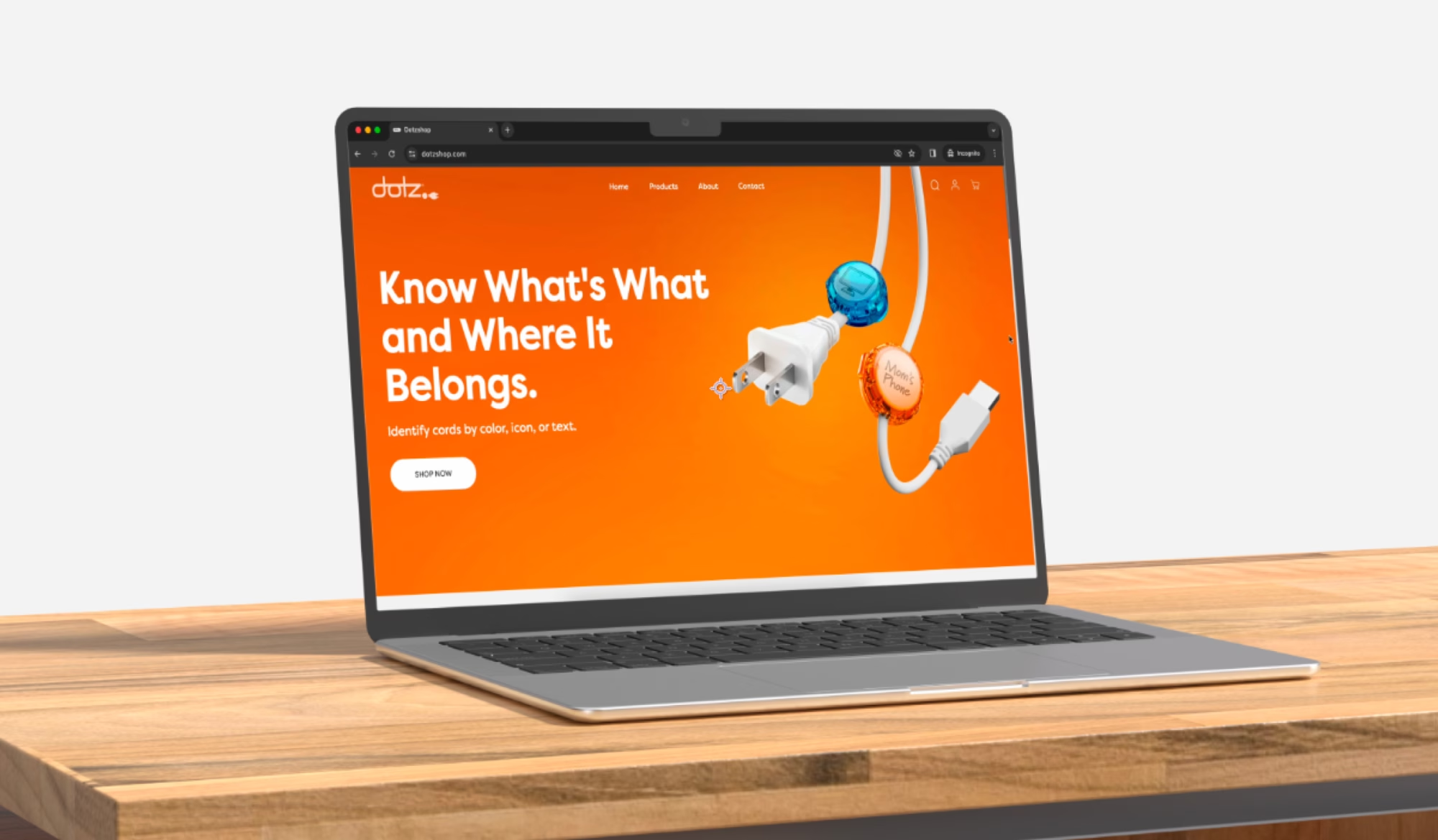
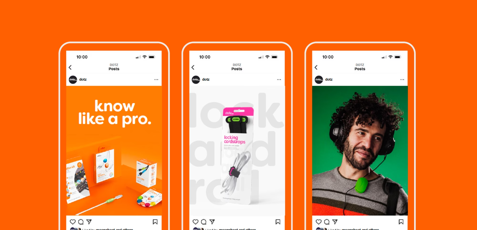
Retail & Digital Experience
The rebrand extended beyond product and packaging, serving as the foundation for a refreshed digital presence across web, social, and ecommerce channels. This new identity sets the stage for continued growth through updated website development, improved Amazon content, and future advertising initiatives. The Dotz team is energized to breathe new life into the product line, beginning with a renewed focus on ecommerce and social platforms as the first phase of expansion.